Dizzying Op Art
Vega III (1957-59), by Victor Vasarely. Source: hero-magazine.com/
I can’t say that I’m a fan of Op Art, though I’ve been drawn to a few works. One (not pictured here) by a grandfather of the movement, Hungarian-French abstract innovator Victor Vasarely (1906-97), inspired me to create Energy & Stillness. However, I wouldn’t call this wall hanging op art. It doesn’t have that hypnotic dimension that Vasarely added to his canvases. His painting was merely a jumping off point for me to combine textiles and stitches in a different way.
Energy & Stillness: Homage to Victor Vasarely, by Mirka Knaster.
I have nothing against this 20th-century art phenomenon. In fact, I find earlier techniques, such as trompe-l'œil, fascinating for conveying an illusion of spatial depth.

Huyendo la crítica (Escaping Criticism), 1874,
by Pere Borrell del Caso.
Source: commons.wikimedia.org/
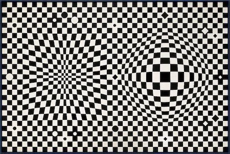
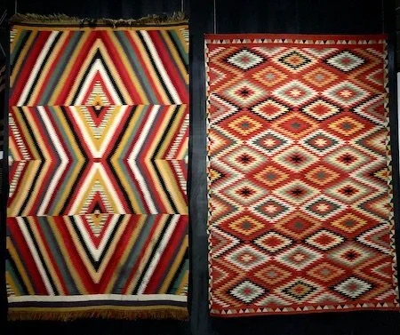
And before the Op Art movement arose in Western art circles, there were the bold and complex designs of Navajo “eyedazzlers” (dah’iistt'ó).
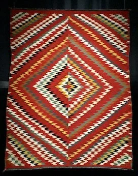
Dah’iistt’ó (Eyedazzler), c.1885, by Navajo artist. Denver Art Museum.
Dah’iistt’ó (Eyedazzler), c.1890), by Navajo artist.
Denver Art Museum.
It’s just that gazing at op art can provoke an unpleasant visceral reaction in me. The Op Art movement is all about perception, illusion, and optical effects. Systematic and precise manipulation of shapes and colors give the impression of movement through patterns that pulsate and flicker, expand and twist, and even seem to protrude. They disorient our perception of what is in the foreground and what is in the background, leaving us with ambiguities and contradictions. I wind up feeling as though I’m on a boat in a choppy sea.
So why write a post about op art? Curiosity. I wonder why some artists have taken their creative expression in that disorienting direction. I imagine its dizzying impact didn’t bother them the way it discomforts me.
Binary (1965), by Bridget Riley. Kunstmuseum Den Haag, The Netherlands. Source: commons.wikimedia.org/
After Vasarely, English painter Bridget Riley (1931- ) is highly recognized for her op art. In an art world that has been dominated by men, she is on a short list of top-selling living women artists. Her early work was figurative and semi-impressionist. As an illustrator at the J. Walter Thompson advertising agency, she adopted a pointillist-like style. According to art critic Jonathan Jones, by studying Seurat’s pointillism, Riley moved toward abstract art and optical illusions. Was there something about perception that intrigued her, that led her, perhaps, to consider art a kind of optical science? In 1965, New York’s Museum of Modern Art held an exhibition called The Responsive Eye, where op art seemed to represent an intersection between art and science.
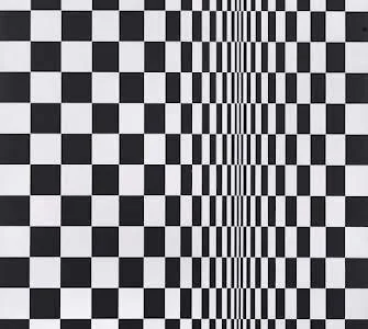
Movement in Squares (1961), by Bridget Riley. Source: https://artsandculture.google.com/
Riley was soon well known for her black and white works of geometric forms. Her first piece, Movement in Squares (1961), is not only a geometric exploration but also one of spatial dynamics. Two flat planes of repeated squares compress and fold into a vanishing line of contact. The painting challenges what viewers actually see. This work, along with others in the early 1960s, left some of them feeling seasick or as if they were skydiving. I know that queasy sensation from going up or down too fast in an elevator (lift, in the UK).
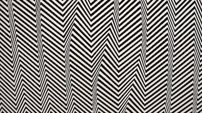
Blaze 1 (1962), by Bridget Riley. Edinburgh, Scottish National Gallery. Source: www.nationalgalleries.org/
As National Galleries Scotland describes it, Blaze 1 appears to be a spiral. However, it is actually a succession of concentric circles made of zigzags, which create a perception of movement. As the “zigs” of one circle meet the “zags” of the next circle, chevrons make the composition appear to rotate. Blaze 1 gives me a clue as to Riley’s penchant for such compositions. She has written of her interest in capturing sensations she experienced in nature, such as dazzling sunlight, when she was a child: “Looking directly into the sun over a foreshore of rocks exposed by the tide–all reduced to a violent black and white contrast.”
Hesitate (1964), by Bridget Riley. London, The Tate.
Source: www.tate.org.uk/
Riley moved into incorporating grays and then colors as well. And she diverged from strictly geometric forms, while still focusing on straight and curved lines.
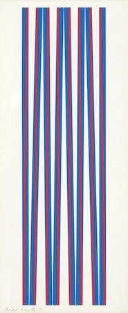
Elongated Triangles (1971), by Bridget Riley.
London, The Tate.
Source: www.tate.org.uk/

Nataraja (1993), by Bridge Riley. London, The Tate.
Source: www.tate.org.uk/
In a conversation with Sir John Leighton at the Scottish National Gallery, Riley says about her work: “It moves. It doesn’t move; it’s absolutely still. But you, by looking, move it….the amazing thing of perception in action.” In other words, it is the viewer, not the artist herself, who completes the work.

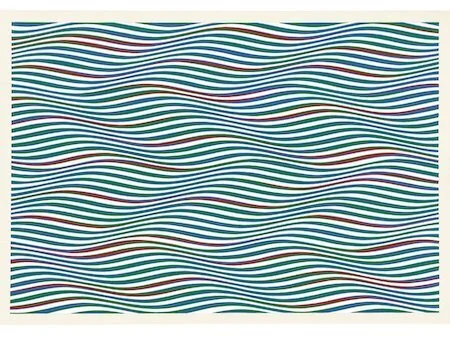
Green Dominance/Blue Dominance/Red Dominance (1977), by Bridget Riley. London: Richard Soulton. Source: www.artsy.net/
Red, Green, and Blue Twisted Curves (1979), by Bridget Riley. Collection of the artist. ©Bridget Riley 2022.
Source: www.smithsonianmag.com
If you’re in the Chicago area, 90 drawings from Riley’s personal collection are in a solo exhibition at the Art Institute of Chicago until January 16, 2023.
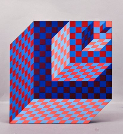
Felhoe (1989), sculpture by Victor Vasarely.
Source: masterworksfineart.com/
While the nature of perception, optical effects, and illusions have fascinated artists for many centuries, it was in the mid-20th century that these interests connected with the latest advances in technology and psychology. There was a growing awareness of how the eye and brain coordinate to perceive color, light, depth, perspective, size, shape, and motion. Perceptual or retinal art captivated public attention to the point of entering the worlds of fashion and media. It has shown up on record album covers and dresses. (In the image below, the woman is not pregnant; the bulge is simply an illusion.)
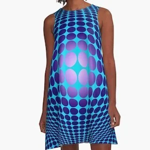
Victor Vasarely Homage 61 A-Line Dress. Designed and sold by Michaela Grove.
Source: redbubble.com/
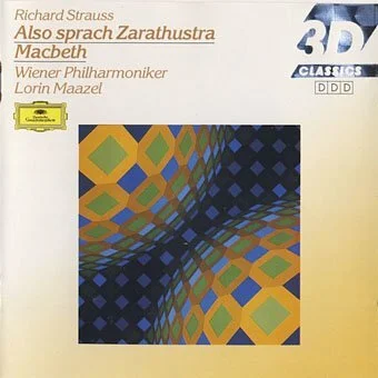
Source: johncoulthart.com/feuilleton/2014/06/05/
But as we’ve all observed over the decades, trends are ephemeral. It’s not that perceptual art has come and gone. Rather, it has taken on new aspects, such as light in the works of James Turrell and others. Each successive group of artists finds its own subjects, ideas, or techniques to challenge them. What can we expect next?
Questions & Comments:
What is it about op art that appeals or doesn’t appeal to you?
Have you explored perception and illusion in your own artwork? What were the results?
What other op artists are you familiar with?